UI components are the building blocks that determine whether an HTML template feels polished or thrown together.
Every button, navigation bar, and form field contributes to the user's first impression, and front-end developers know that impression forms in milliseconds. When you're assembling a template for a landing page, a dashboard, or a marketing site, the components you include dictate usability, accessibility, and conversion rates.
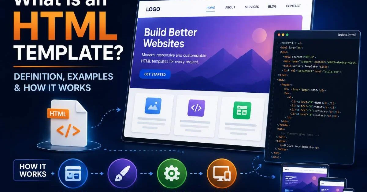
Skipping even one foundational element can send bounce rates climbing. If you're still getting familiar with the basics, our guide on what an HTML template is and how it works is a solid starting point. This article walks through the specific UI components you should bake into every template, why each one matters, and how to implement them correctly. Think of it as a practical checklist you can reference every time you start a new project.
Key Takeaways
- A responsive navigation bar is the single most impactful UI component in any template.
- Hero sections with clear CTAs consistently outperform templates without them in conversions.
- Well-structured form components reduce abandonment and improve data collection quality.
- Footer components handle trust signals, legal links, and secondary navigation efficiently.
- Card-based layouts adapt to content types from products to blog posts with minimal refactoring.
1. Navigation and Header Components
Responsive Navbar Patterns
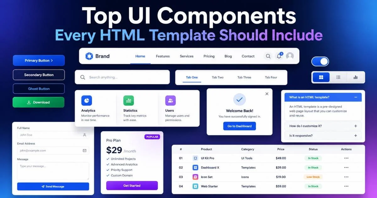
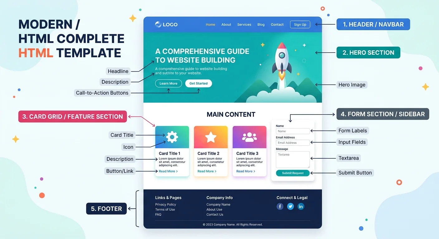
The navigation bar is the skeleton of your template. It tells users where they are, where they can go, and what matters most on your site. A solid navbar includes your logo or brand mark, primary navigation links, and at least one prominent action button (like "Sign Up" or "Get Started"). On desktop, horizontal layouts with dropdowns work well; on mobile, a hamburger menu that expands into a full-screen or side-drawer overlay is the standard pattern most users expect.
Semantic HTML matters here more than most developers realize. Use the <nav> element with an appropriate aria-label to help screen readers differentiate between multiple navigation regions. Each link should live inside an unordered list, and dropdown menus should be toggled with aria-expanded attributes. These small additions cost minutes in development time and save you from accessibility audit failures down the road.
Test your navbar at 320px, 768px, and 1440px breakpoints to catch layout issues before they reach production.
Sticky Headers and Scroll Behavior
Sticky headers keep navigation visible as users scroll, reducing the effort to move between sections. The simplest implementation uses position: sticky; top: 0; in CSS, though you may want to add a shadow or background opacity change on scroll using a lightweight JavaScript observer. Be careful with sticky headers on mobile, where vertical space is limited. A header taller than 60px on a phone screen eats into content visibility and frustrates users trying to read long-form pages.
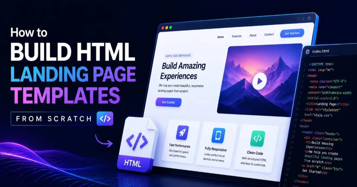
If you're building HTML landing page templates from scratch, the header is the first component you should lock down. It sets the visual tone and establishes the grid system that the rest of your template follows. Deciding between a transparent overlay header and a solid-background header early on prevents layout rework later. Many developers underestimate how much the header choice affects the hero section beneath it.
2. Hero Sections and Call-to-Action UI Components
Hero Layout Structures
The hero section occupies the most valuable real estate on any page. It typically spans the full viewport width (and often the full height) and communicates the core value proposition in under five seconds. A well-built hero includes a headline, a subheadline or supporting paragraph, a primary CTA button, and either a background image, illustration, or video. Split-screen layouts that place text on one side and media on the other perform particularly well for SaaS and portfolio templates.
When choosing between a full-bleed background image and a contained layout, consider load performance. Hero images should be served in WebP format with appropriate srcset attributes for different screen sizes. A hero image that weighs 2MB on mobile is a conversion killer. Lazy loading doesn't help here because the hero is above the fold; instead, preload the image using a <link rel="preload"> tag in your document head for faster rendering.
CTA Button Best Practices
Your call-to-action buttons are where UI components directly translate into business outcomes. A CTA should have sufficient padding (at least 12px vertical, 24px horizontal), a contrasting background color, and text that describes the action rather than just saying "Submit" or "Click Here." Phrases like "Start Free Trial" or "Download Template" outperform generic labels consistently. Place the primary CTA within the hero and repeat it at logical intervals throughout the page.
"The best UI components are invisible to users but unmistakable in their effect on conversion rates."
Consider adding a secondary, lower-commitment CTA alongside your primary one. For example, pair "Get Started Free" with "Watch Demo" to capture visitors who aren't ready to commit. The secondary button should use an outline or ghost style to visually defer to the primary action. This pattern is standard in modern landing page templates and gives you two entry points into your conversion funnel rather than one. Maintaining strong brand authority through strategic design decisions starts with these small but measurable choices.
3. Forms, Cards, and Interactive Elements
Form Component Essentials
Forms are where users hand you their information, so the friction must be minimal. Every template should include a reusable form component with properly labeled inputs, visible validation states, and logical tab order. Use the <label> element explicitly tied to each input via for and id attributes. Placeholder text alone is not a substitute for labels, as it disappears once users start typing and creates accessibility problems for screen reader users.
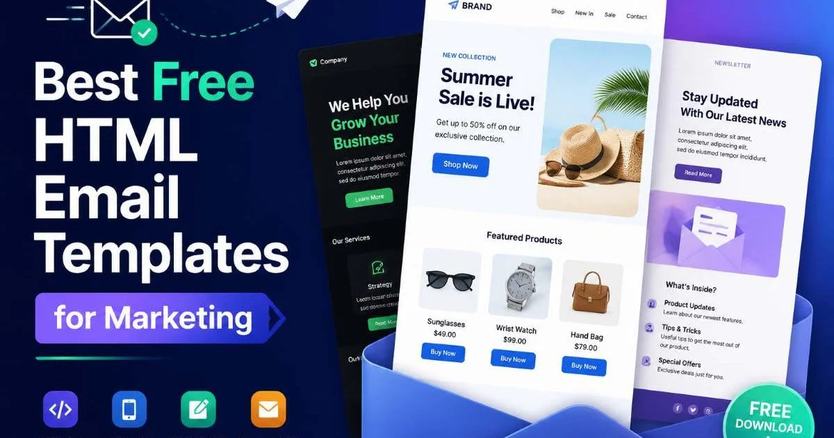
Inline validation gives immediate feedback and reduces form abandonment rates dramatically. Show success states with green borders, error states with red borders and descriptive messages below the field, and use aria-describedby to connect error messages to their inputs programmatically. If your template targets marketing use cases like email campaigns, your forms will likely handle newsletter signups, so keep them short (name and email only) to maximize completion rates.
Always include a visible privacy statement near form submit buttons to comply with GDPR and build user trust.
| Template Type | Required Inputs | Optional Inputs | Recommended Validation |
|---|---|---|---|
| Landing Page | Email, Name | Phone, Company | Email format, required fields |
| E-commerce | Address, Payment | Gift message, Promo code | Postal code, card number (Luhn) |
| Dashboard | Username, Password | 2FA code, Remember me | Password strength, match confirm |
| Contact Page | Email, Message | Subject, Attachment | Email format, message length |
| Email Template | Unsubscribe link | Preference center | Valid email on re-subscribe |
Card-Based Layouts
Cards are the most versatile UI components in a developer's toolkit. A single card component can display blog posts, product listings, team members, pricing tiers, or testimonials with only minor modifications to its inner HTML. Build your card with a media slot (image or icon), a title, a short description, and an action link or button. CSS Grid or Flexbox handles the layout, and a consistent border-radius with subtle box-shadow gives each card visual separation from the background.
When implementing cards, plan for content variability. Some cards will have long titles; others will have no image. Use CSS techniques like min-height, line-clamp, and object-fit: cover for images to maintain visual consistency across cards with different content lengths. If you're debating whether to use HTML templates versus writing custom code, cards are a perfect example of where templates save significant time because the pattern repeats so frequently across projects.
Add a hover state that lifts the card with translateY(-4px) and increases the shadow for a tactile, interactive feel.
4. Footer, Trust Signals, and Supporting Components
Footer Anatomy
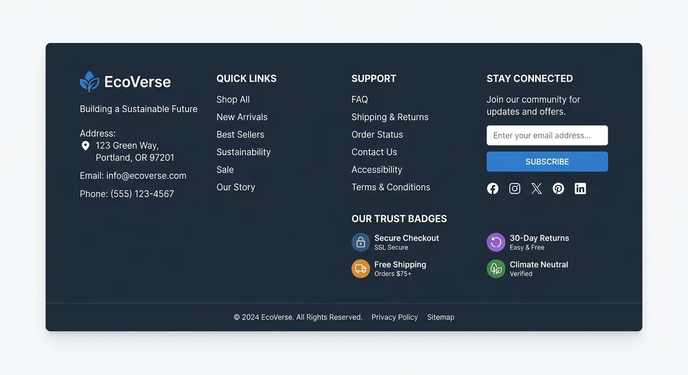
Footers tend to be afterthoughts, but they serve real functional purposes. A complete footer includes secondary navigation organized into columns (Product, Company, Resources, Legal), contact information, social media icon links, and copyright text. For templates targeting business sites, a footer also needs links to your privacy policy, terms of service, and cookie preferences. Structure the footer using a CSS Grid with three to four columns that collapse into a stacked layout on mobile screens.
Newsletter signup forms in the footer capture visitors who've scrolled the entire page, indicating high engagement. Place a compact email input with a subscribe button here. The footer is also the right location for trust badges, security seals, and partner logos. Users who scroll to the bottom are often in a decision-making phase, and these elements provide the final reassurance they need. Your site's TLS certificate status also matters here, since browsers flag insecure sites prominently and undermine those trust signals.
Trust and Social Proof Elements
Beyond the footer, trust components should appear throughout your template. Testimonial blocks with real names, photos, and company affiliations perform far better than anonymous quotes. Logo bars showing client or partner brands take up minimal vertical space while communicating credibility instantly. Star ratings and review counts near product cards or pricing sections reduce purchase hesitation. These UI components don't just look good; they directly affect whether visitors convert or leave.
Notification bars, toast messages, and modal dialogs round out the supporting components every template needs. A notification bar at the top of the page can announce promotions, cookie consent, or system status. Toast messages confirm user actions (like a successful form submission) without disrupting the page flow. Modals should be used sparingly, only for actions that require focused attention like confirming a deletion or completing a checkout step. Overusing modals annoys users and increases bounce rates.
Never auto-trigger a modal on page load. Wait for a user action or at least a 30-second delay to avoid frustrating first-time visitors.
Frequently Asked Questions
?How do I implement aria-expanded correctly in a dropdown navbar?
?Should I use a sticky header or a static one for a landing page template?
?How long does it realistically take to build these core UI components from scratch?
?Is a hamburger menu still the right mobile nav pattern in 2025?
Final Thoughts
Building a strong HTML template comes down to selecting the right UI components and implementing them with care. Navigation, hero sections, forms, cards, footers, and trust elements form the core set that every project needs.
Get these right, and you create a foundation that adapts to landing pages, dashboards, email layouts, and marketing sites without starting over each time. Prioritize accessibility, test across breakpoints, and treat every component as an opportunity to earn user trust rather than just fill space.
Disclaimer: Portions of this content may have been generated using AI tools to enhance clarity and brevity. While reviewed by a human, independent verification is encouraged.